Histograms
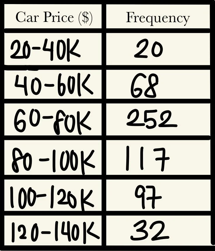
Histograms are often confused with bar graphs, however, there is one crucial difference separating the two: while bar graphs deal with categorical data, histograms deal with continuous data. To illustrate this, assume we have a table of data with the intervals of prices of cars in a dealership:
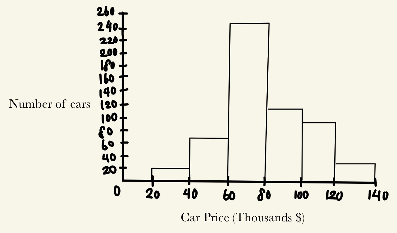
When presented in graph form, a histogram has no gaps between bars, and its intervals cannot be reordered. In comparison, a bar graph has gaps between bars, and because the data are categorical, can be reordered without changing the data’s general representation. The histogram for the table above is shown here:
Most likely, we will be given a list of data points with no accompanying table. In this case, we must decide the length of each of our intervals to best represent the data, and sort the data points according to our intervals, counting the frequency. For example, let’s say instead of car prices, we’re given the various distances of runs that Jacob has gone on.
4, 4, 5, 8, 3, 7, 10, 12, 4, 9, 2, 5, 15, 14
Let’s reorder the data in ascending order.
2, 3, 4, 4, 4, 5, 5, 7, 8, 9, 10, 12, 14, 15
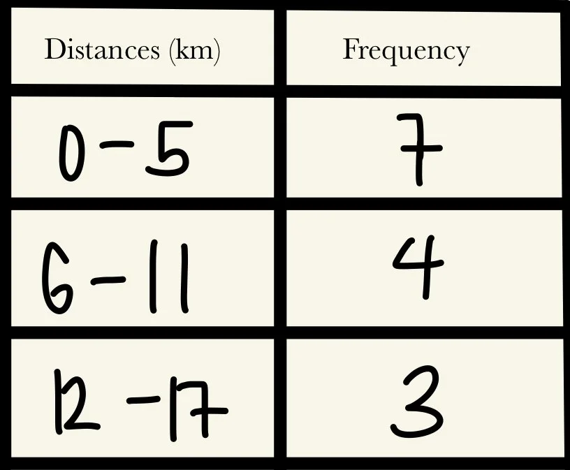
What should our intervals be? Well, we want to avoid having too few intervals. We can divide the data into 0-5, 6-11, and 12-17 (note that our intervals do not have to fit perfectly).
Now we need to create a table with our intervals and the frequency of data points:
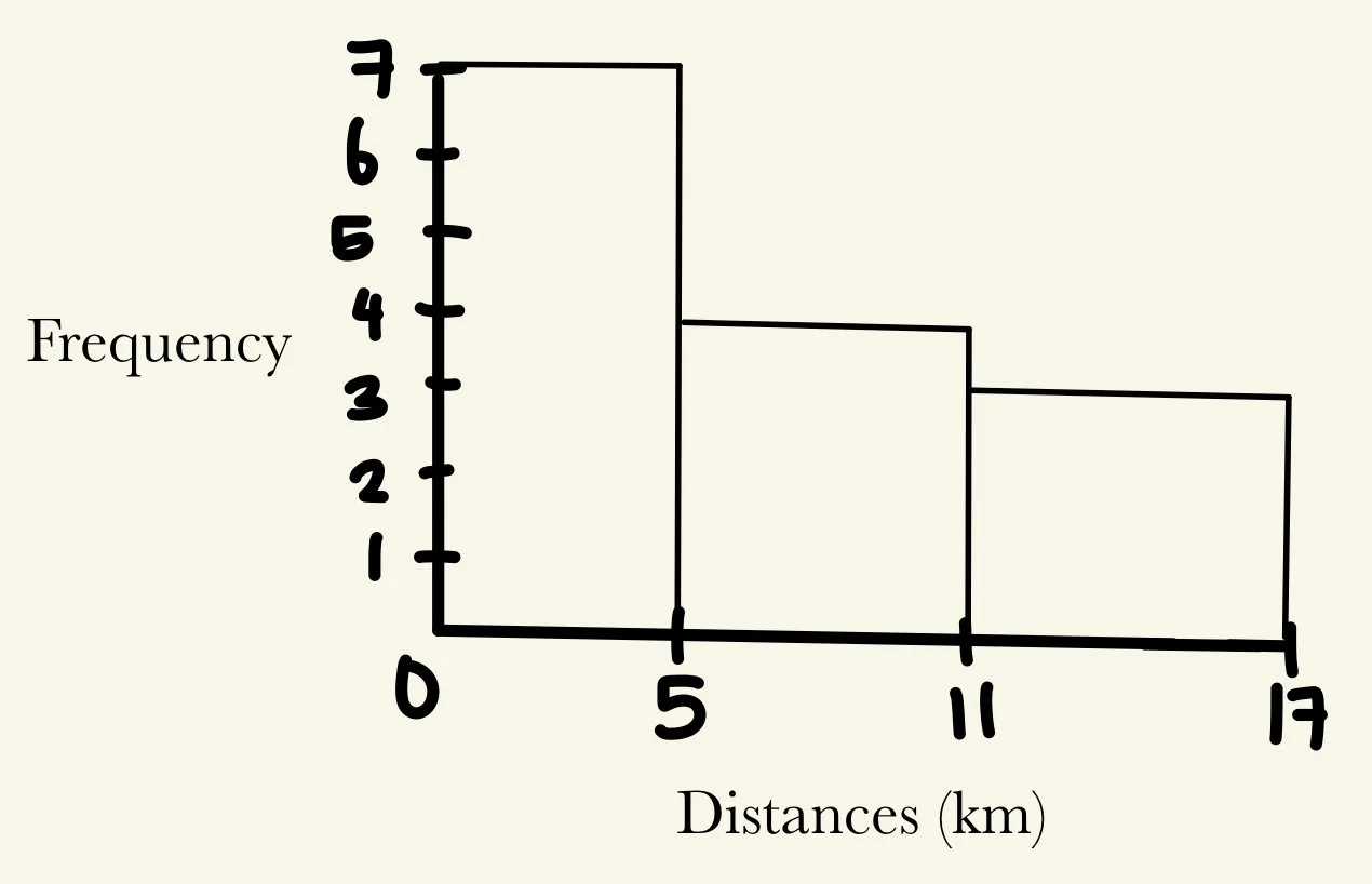
Graphing our table, we have